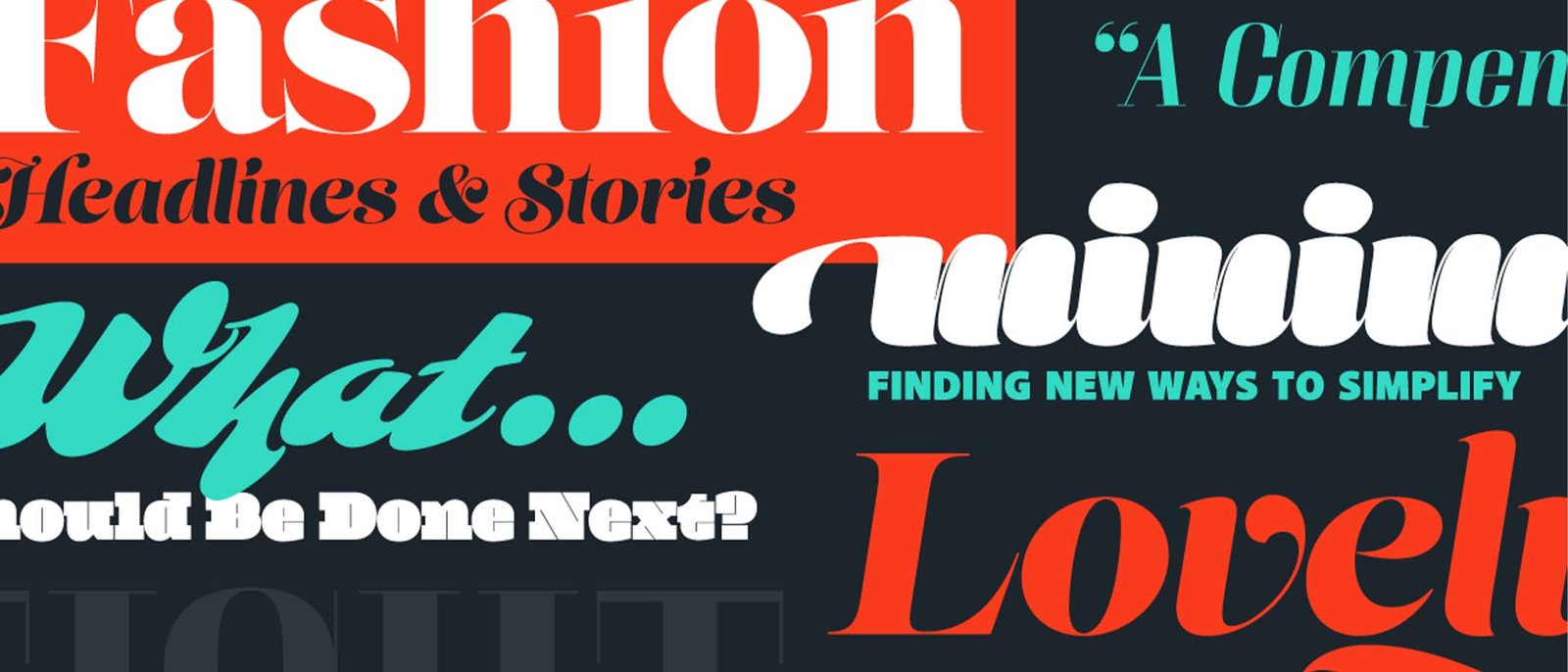
Crafting Compelling Designs: Harnessing High Contrast and Bold Typography
Introduction: In the dynamic world of design, two elements reign supreme: high contrast and bold typography. These elements are like the dynamic duo of design, capable of grabbing attention and making a lasting impression. Let’s explore how you can wield high contrast and bold typography to create designs that captivate your audience.
1. The Power of High Contrast: High contrast is the secret ingredient that makes your designs pop. It’s all about creating visual tension by pairing light and dark elements. Tools like Adobe Photoshop’s Levels adjustment or Canva’s contrast slider can help you achieve that perfect balance. For instance, imagine a sleek black headline against a crisp white background—it’s like a spotlight in a dark room, drawing the viewer’s gaze instantly.

2. Embracing Bold Typography: Bold typography is the voice of your design—it speaks volumes before the words are even read. Tools like Google Fonts or Adobe Typekit offer a plethora of bold fonts to choose from. Consider a striking sans-serif font like Montserrat or a bold serif like Playfair Display to command attention. With bold typography, your message becomes impossible to ignore.
3. Achieving Balance and Harmony: Finding the right balance between high contrast and bold typography is key to creating harmonious designs. Tools like Figma or Sketch provide intuitive interfaces for experimenting with layout and composition. Remember, contrast should enhance readability, not hinder it. Pair bold typography with subtle background textures or gradients to create depth and visual interest.
Conclusion: In the realm of design, high contrast and bold typography are indispensable tools for crafting compelling visuals. By mastering these elements and leveraging the right tools, you can create designs that leave a lasting impact on your audience. So go ahead, experiment fearlessly, and unleash the full potential of high contrast and bold typography in your next project.


