Evolving User Interfaces: From Flat Design to Material Design Trends
Introduction: User interface design has come a long way from the days of skeuomorphic textures to the more minimalist approach of flat design. However, as technology advances, so do design trends. One such evolution is the shift from flat design to material design, bringing depth, interactivity, and realism to user interfaces.
Flat Design: A Minimalist Approach Flat design emerged as a reaction to skeuomorphism, focusing on simplicity, clean lines, and minimalistic aesthetics. It favored two-dimensional elements, vibrant colors, and typography to create intuitive user experiences. Examples of tools for flat design include Adobe Illustrator, Sketch, and Figma.

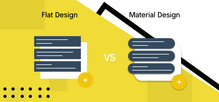
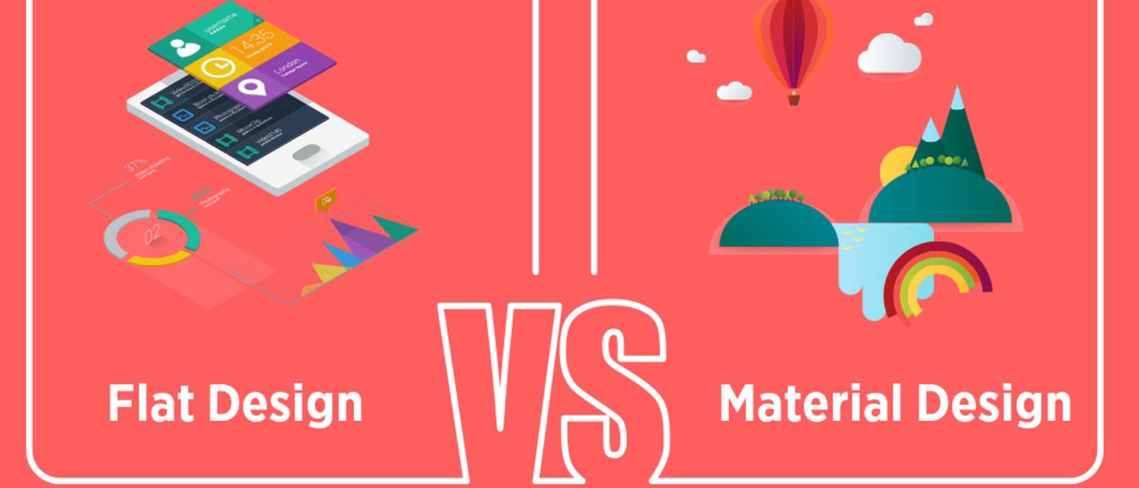
Material Design: Adding Depth and Realism Material design, introduced by Google, builds upon the principles of flat design while adding depth, shadow, and motion to create a more realistic user interface. It emphasizes responsive animations, dynamic transitions, and interactive elements inspired by real-world materials. Tools like Adobe XD, Framer, and Proto.io facilitate the implementation of material design principles.
Key Differences and Advantages While flat design offers simplicity and clarity, material design enhances user engagement through tactile feedback and visual cues. Material design’s focus on hierarchy and motion creates a more intuitive user experience, particularly in mobile app development. Its use of elevation, lighting, and depth elevates interfaces from static to dynamic.
The Future of UI Design As technology continues to evolve, so too will user interface design trends. From flat design to material design and beyond, designers must adapt to new tools, techniques, and user expectations to create memorable and effective interfaces that seamlessly integrate with evolving technologies.


