Micro Animations Add Depth to Web Design
In the fast-paced world of web design, every detail matters. Micro animations, those subtle, nuanced movements that often go unnoticed, are the unsung heroes that can elevate your website’s user experience to a whole new level. Let’s delve into the magic of micro animations and explore how they add depth and sophistication to web design.
Captivating First Impressions
Micro animations are the secret sauce that turns a static webpage into a dynamic, engaging experience. From a gentle fade-in of elements to a slight bounce upon loading, these animations captivate visitors from the moment they land on your site.
Intuitive Navigation
Guide your users effortlessly through your website with micro animations that provide visual cues. Whether it’s a subtle color change on hover or a smooth transition between pages, these animations make navigation intuitive, leaving users delighted and in control.
Feedback That Speaks Volumes
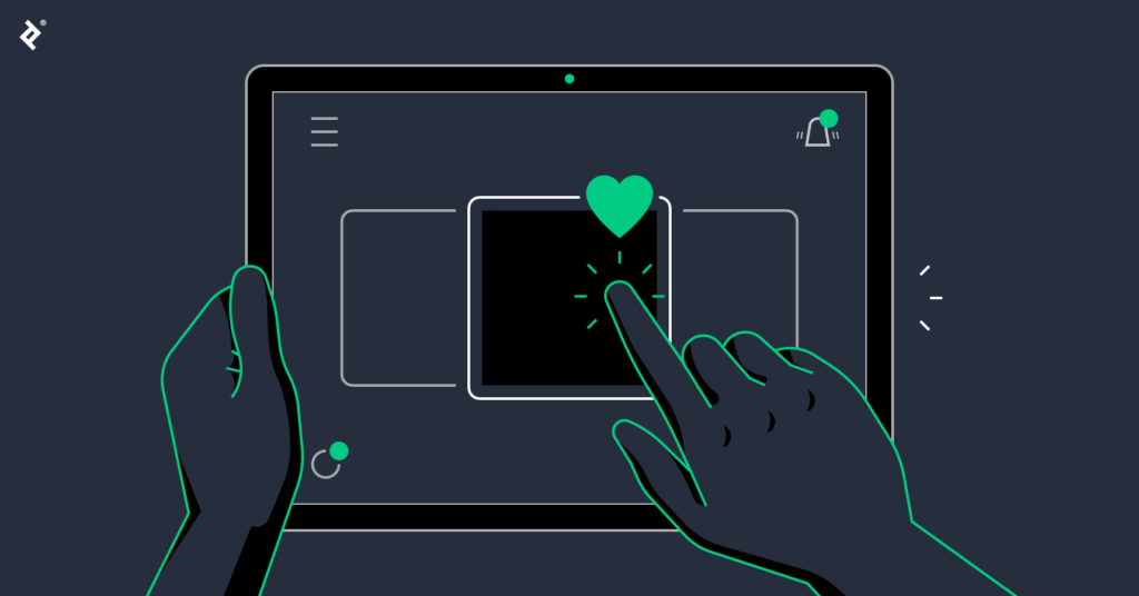
Micro animations serve as silent communicators, providing instant feedback to user actions. From a heart icon pulsating with a click to a button subtly changing shape upon selection, these animations create a tactile and responsive interface that users will appreciate.
Loading Doesn’t Have to Be Boring

Transform the mundane loading process into a delightful experience with micro animations. A spinning icon or a creative loading bar not only keeps users entertained but also gives the impression of a faster-loading website.
Brand Personality in Motion
Infuse your brand’s personality into the digital realm through micro animations. Whether it’s a logo that gracefully morphs into place or a signature motion for call-to-action buttons, these animations reinforce brand identity and leave a lasting impression.
In conclusion, micro animations are the unsung heroes of web design, adding depth, interactivity, and personality to your digital space. Pay attention to the small details, and let these subtle movements create a memorable online experience for your users.


